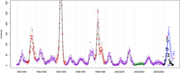
Fig. 1.
San Juan incidence data (open circles) over most of the training period. Incidence here are the number of reported cases of dengue each week. The colors indicate a judgment of severity in data that have been observed, specifically: green = mild (< 25 cases in any week), purple=moderate (25–100 in any week), red = severe (> 100 cases in any week). Further discussion is provided in Section 3.1.2. Future, unobserved data are indicated with black open circles. Solid lines indicate the mean predictive curve and dashed lines the 2.5% and 97.5% quantiles around this mean. The black lines are the within-sample fits. The blue lines are the forecasted dynamics for the unobserved season (see Section 3). In the unobserved season, red circles indicate the true values of targets (see Section 2.2), blue open circles indicate point forecasts for the targets, and central 95% predictive intervals around those are indicated with blue error bars (see Section 4.2).

