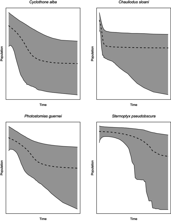
FIGURE 3.

Extended Bayesian skyline plots. The x‐axis represents time, with the left side of the axis being the most recent time point. The y‐axis represents relative population size on a log scale. The gray area displays the 95% central posterior density.
