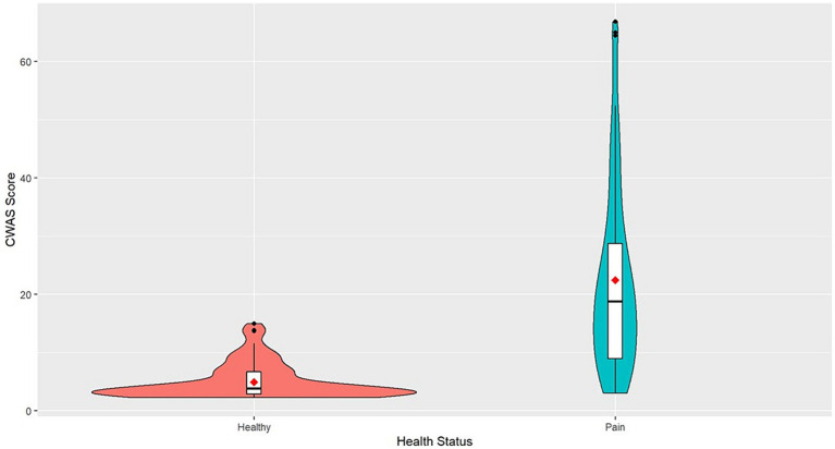
Figure 1.
Violin plot of CWAS of healthy dogs and dogs with chronic pain. The violin plot represents the range and concentration of the scores with the widest part showing the highest frequency of scores. The center of each violin plot shows a boxplot with the median line and first and third quartile data on either side. The mean scores are represented as the red point.

