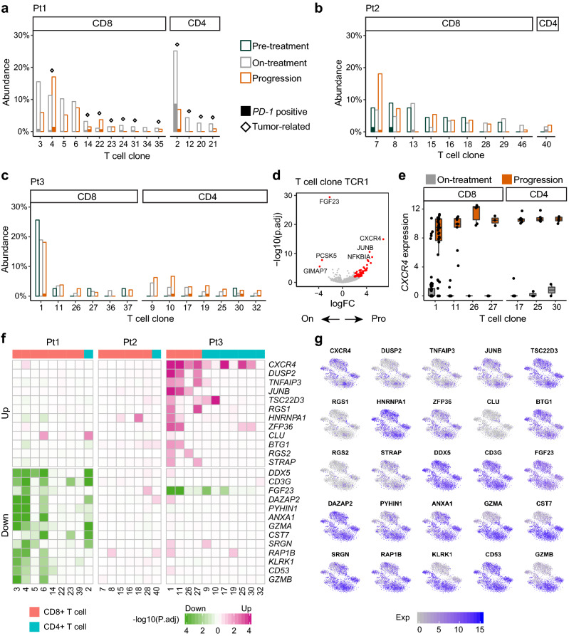
Fig. 4.
Dynamics of individual T cell clones during the treatment. a, b, c The abundances of individual T cell clones at each time point in Pt1 (a), Pt2 (b) and Pt3 (c). The diamond above the bar represents the tumor-related clone. The height of solid bar represents the percentage of PD-1+ T cells. d Volcano plot showing DEGs between on-treatment and progression time points in the T cell clone TCR1. e Boxplot showing gene expression of CXCR4 in T cell clones from Pt3. f Heatmap showing the frequent DEGs between on-treatment and progression time points in individual T cell clones. g Expression levels of the frequent DEGs illustrated in t-SNE plots

