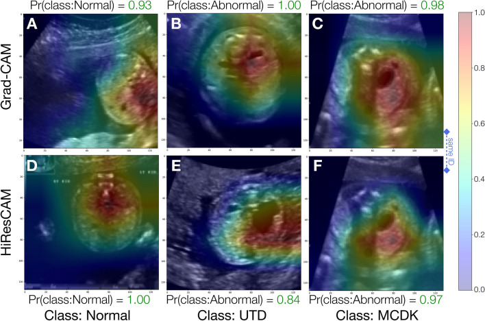
Figure 8.
Sample visual explanations for successful model predictions. Panels (A–C) depict GradCAM activation maps whereas panels (D–F) depict HiResCAM activation maps. Panels in column (C,F) depict activation maps for the same patient ID to enable comparison of the activations maps of the two visual explanation methods for the same image. Pr(class:Normal) and Pr(class:Abnormal) are the probabilities for the Normal and Abnormal class respectively. The color bar units, ranging from 0.0 to 1.0, are unitless and denote the relative contribution of each pixel towards the model’s decision, where blue signifies low or negative importance and red signifies high importance.

