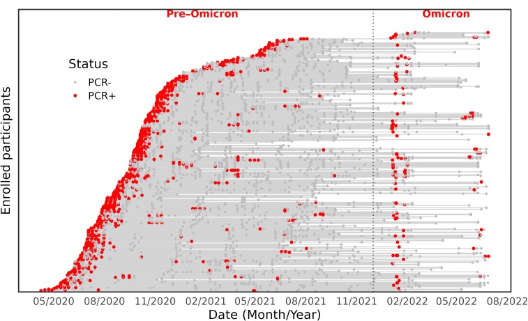
Figure 1.
Timing of infections for reinfected and nonreinfected individuals; virological results for each participant (n = 331). The follow-up period for each individual in the cohort is represented by a horizontal gray line, starting from the recruitment date. The lines are stacked on each other to form a sloping curve. The vertical dashed line separates the pre-Omicron and Omicron periods. The red dots represent each participant's positive reverse transcription polymerase chain reaction (RT-PCR) result and gray dots represent negative RT-PCR results.

