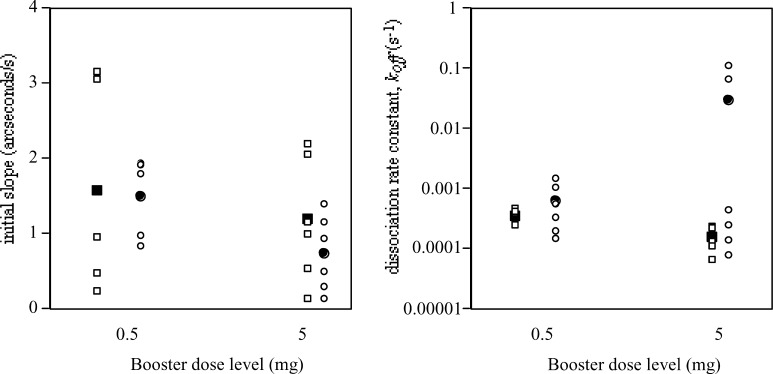
Fig. 5.
Biosensor results for two groups of patients 1 month after the final vaccination booster. Results for HAMA shown as squares, for Ab2 as circles. Means are shown as solid circles or squares. The graph on the left shows quantity (initial slope) and the graph on the right, dissociation rate constant (k off)

