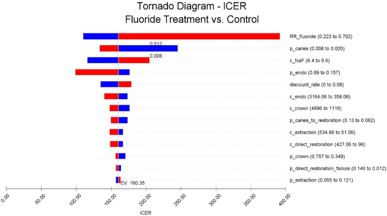
Fig. 3.
Tornado diagram of the one-way sensitivity analysis. The tornado diagram depicts the range of ICER resulting from the uncertainty of each parameter. It suggests that the risk ratio of root caries in the fluoride treatment group had the greatest impact on the result of the model. The blue part of the bar represents that the ICER increased or decreased from the base case value due to the decrease in the associated parameter, while the red part represents that the change is due to the increase in the parameter. ‘c’ represents cost, and ‘p’ represents transition probability in the names of parameters

