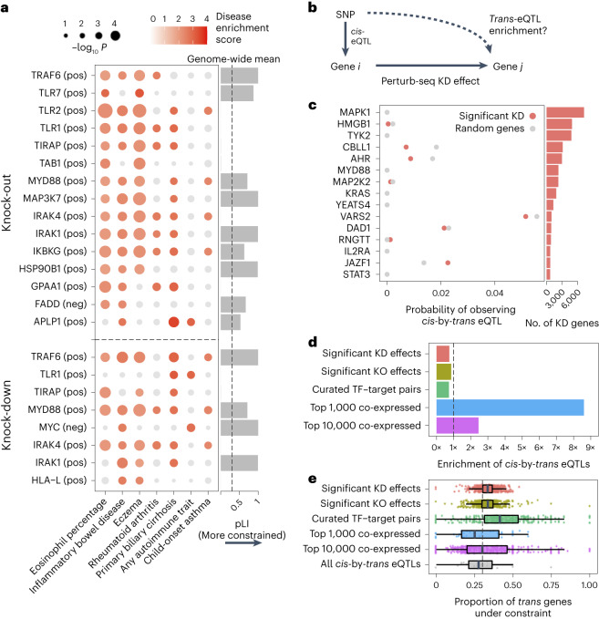
Fig. 6. Integration of population genetic screens with Perturb-seq.
a, Heritability enrichment scores of signatures comprising genes significantly modulated by perturbations (rows) across human traits (columns), computed using sc-linker55. ‘pos’ indicates the set of genes whose expression changes in the same direction as the perturbed gene (that is, downregulated by the perturbation), with the opposite applying to ‘neg’. Displayed are all perturbation signatures and traits with at least two significant (P < 0.001) effects. Non-significant scores are grayed out. Bar plot: probability of loss-of-function intolerance54 (pLI) of the corresponding perturbed gene. b, Schematic of eQTL integration analysis, aiming to test whether trans-regulatory relationships learned from Perturb-seq are also present in eQTL studies. For all gene pairs in which gene i exerts an effect on gene j (that is, has a significant KD effect in our Perturb-seq screen), we would expect that gene i and gene j are enriched for cis-by-trans eQTLs. c, Using data from an eQTL study closely matching our cell type and treatment27, shown is the probability of observing significant cis-by-trans eQTLs among the top 15 perturbed genes from our KD screen and their affected downstream genes (red) compared to random downstream genes (gray). d, Enrichment of significant cis-by-trans eQTLs among various sources of gene–gene pairs: significant KO/KD effects (representing significant gene–gene effects from our KO and KD screens, respectively), curated transcription factor (TF) and target gene pairs65 and the top 1,000/10,000 most co-expressed gene pairs (based on correlation of expression across samples) from the eQTL dataset. Enrichment was computed relative to random trans genes for each cis gene and then averaged over all cis genes. e, Selective constraint on trans genes from d plus all significant cis-by-trans eQTLs from the Fairfax et al.27 dataset. Each point represents a cis gene, whereas the x axis represents the proportion of the trans genes for each cis gene that are under selective constraint (determined as having a pLI >0.5). Box plots represent the median and first/third quartile of points, whereas the bounds of the whiskers represent 1.5× interquartile range.

