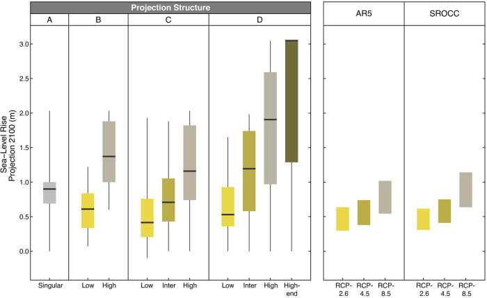
Fig. 3. Comparison of sea-level rise projections in planning and available science.
Left: The SLR projections (in meters) for 2100, which respondents use in their coastal plans and guidance documents. Projections are grouped by the four projection structures (A to D) shown in Fig. 2 and shown as box plots with median values as the dark center line, the box representing the 25th to 75th percentiles, and the whiskers showing the full range of survey responses. Right: The IPCC Fifth Assessment Report (AR5)1 and Special Report on the Ocean and Cryosphere in a Changing Climate (SROCC)5 global projections show the “likely” ranges between the 17th and 83rd percentile.

