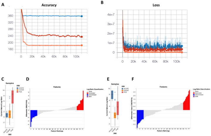
Figure 10. Multinomial regression analysis of the uterine microbiome 30 days postpartum.
(A) Graph representing the prediction accuracy (capacity of the model to predict the observed read counts in samples) for the null model (blue line), a model with only the categorical information of flush phenotype (red line) and the full model (orange line). The x-axis shows the number of iterations which represents the number of times the model trained across the entire dataset. The y-axis shows the cross-validation (CV) values representing the accuracy of the model. (B) The loss graph represents how well each model fits the data. The y-axis is the negative log probability of the model fitting the data (a lower number indicates a better fit of the model). The x-axis indicates the number of iterations. The “sample plot”, (C and E), shows the log-ratios of abundance within samples for the selected top 10 ASV that increased and decreased (selected top 10 and bottom 10 ASV) in cows with purulent and acute flush phenotype compared with cows with clear phenotype, respectively. Furthermore, the “rank plot”, (D and F), shows the feature rankings, a visualization of how features are ranked in comparison with the other features evaluated.

