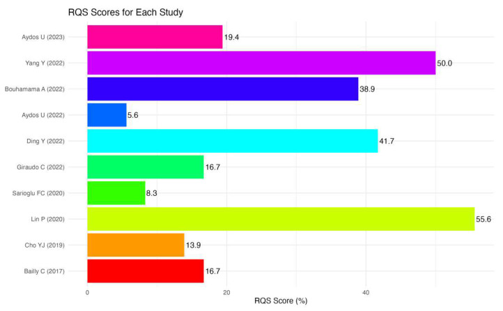
Figure 2.
Radiomics Quality Score (RQS) assessment. The horizontal bar chart presents the distribution of RQS total % across different studies. Each colored bar corresponds to a specific study, with the length of the bar indicating the RQS. The chart provides a visual comparison of RQSs, aiding in the assessment of variability and central tendency among the studies. Study names are listed on the y-axis, and RQSs are indicated on the x-axis [11,12,13,14,15,16,17,18,19,20].

