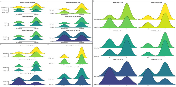
Fig 4. Distributions and interactions between indicators with the strongest relationship to differences in perceived management effectiveness in Kenya.
Density plots demonstrating the relative proportion of individuals responding that they believed management was either not effective (left) or effective (right) across different values of: (A) the top three most important indicators (WAMR: Women’s Access to Marine Resources; TM: Trained in Management; WNG: Women’s Nature Groups); (B-D) two-way interactions between the top three indicators; and (E) three-way interactions between all indicators (x-axis: (NE) not effective; (E) effective). Numbers on either side of density plots represent the total number of individuals for each feature or combination of features that believed management was effective (right side) or not effective (left side).

