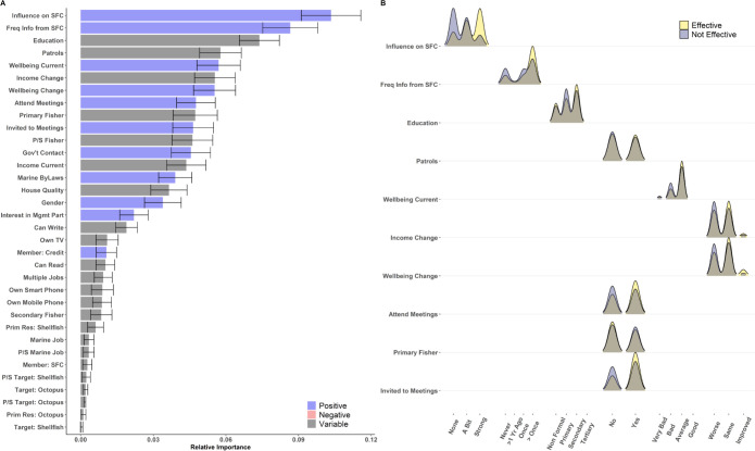
Fig 5. Relative importance and distribution of responses for indicators most strongly associated with differences in perceived management effectiveness in Tanzania.
(A) Relative importance of features to differences in perceived effectiveness. The length of solid bars along the x-axis represents the average feature importance for each variable across 100 model iterations, and the color of bars indicates relationships between increases in each metric and more positive perceptions of management effectiveness (blue: positive; red: negative; gray: variable). Error bars represent the standard deviation of importance across model runs. (B) Density plots of individual responses for the top 10 most important metrics, separated by individuals that believed management was effective (yellow) and not effective (purple). Brown areas represent overlapping values between individuals that believed management was effective and not effective.

