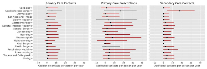
Fig. 1.
Additional yearly contacts with primary care, primary care prescriptions, and secondary care for patients waiting for treatment (treatments) compared to matched controls. Additional contacts per person per year were obtained by bootstrap sampling controls for each treatment 1000 times, resulting in 1000 distributions. Black dots represent the median additional contacts per person per year, obtained by averaging the median values of the 1000 distributions. Red lines represent the mean 25th percentile and 75th percentile (interquartile range) of the 1000 distributions of additional contacts, per person, per year. For specialties where there was no evidence of a difference in utilisation (p > 0.0004), results are displayed in grey

