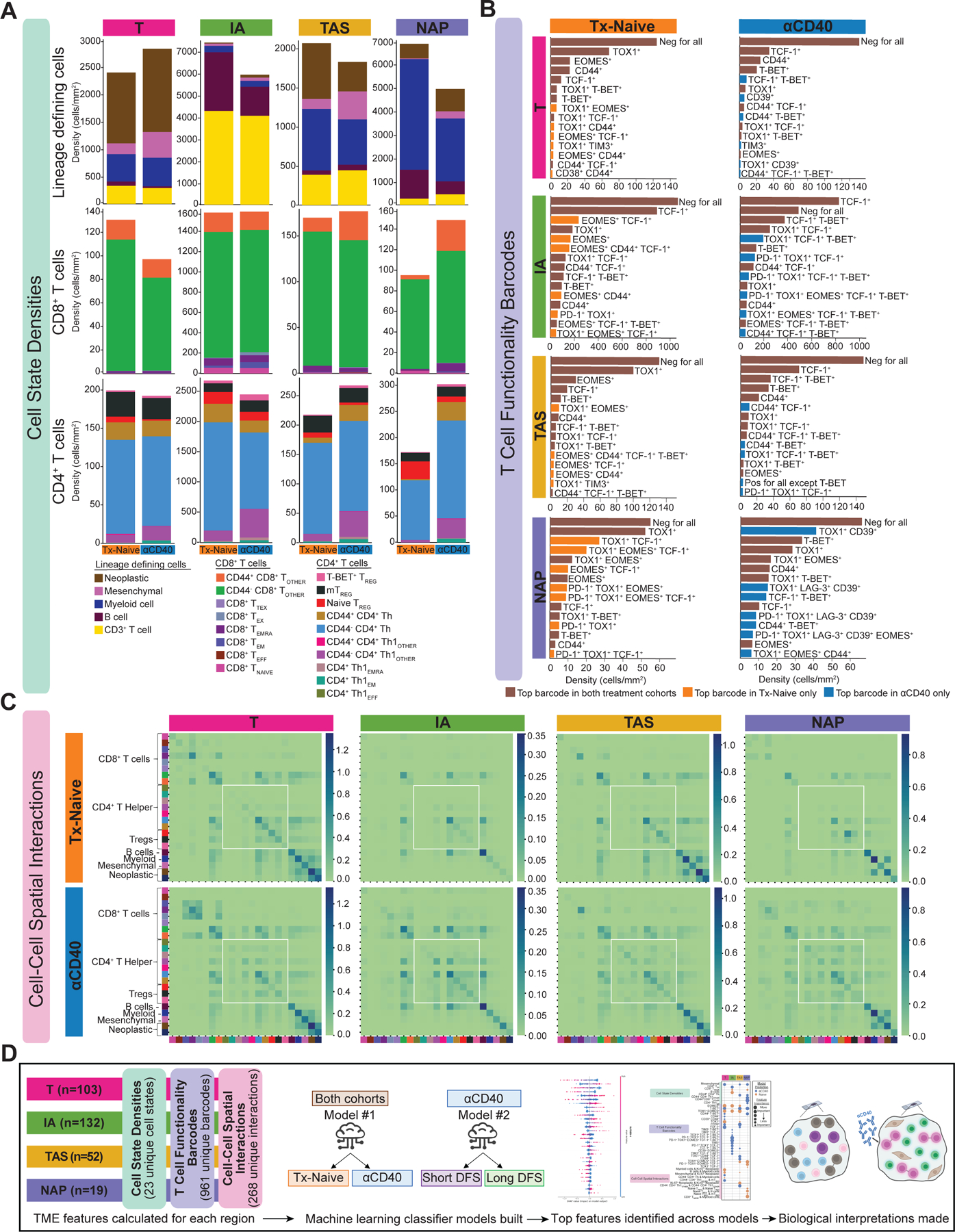
Figure 2. Interrogating cell states and spatial interactions within the PDAC TME.

A. Stacked bar charts showing the average cell state densities for each treatment cohort and histopathologic site. Top row: lineage defining cells including neoplastic epithelial cells, mesenchymal fibroblast-like cells, myeloid cells, B cells, and CD3+ T cells; Middle row: CD8+ T cell states; Bottom row: CD4+ T cell states. Columns denote histopathologic site, and each plot is further broken into treatment cohort.
B. Bar charts showing average densities of barcoded T cells for each treatment cohort and histopathologic site. Only the 15 most abundant barcodes are shown as measured by average density. Rows denote histopathologic site, and columns denote treatment cohort. Brown bars denote barcoded T cells that are in the top 15 most abundant barcodes in both cohorts. Orange bars denote barcoded T cells that are in the top 15 most abundant barcodes in the treatment-naive cohort only. Blue bars denote barcoded T cells that are in the top 15 most abundant barcodes in the anti-CD40-treated cohort only.
C. Heatmaps showing average number of spatial interactions between two cell states for each treatment cohort and histopathologic site. Cell states are denoted by colors shown in Figure 1F. Interactions were normalized first by density of cells participating in the interaction and were then log10+1 transformed. Rows denote treatment cohort and columns denote histopathologic site.
D. Overview schematic of analyses performed in this study. TME features were calculated for each tissue region. Two ML classifier models were built for each histopathologic site to predict treatment status and DFS. Feature importance analyses were performed to interpret biological meaning.
