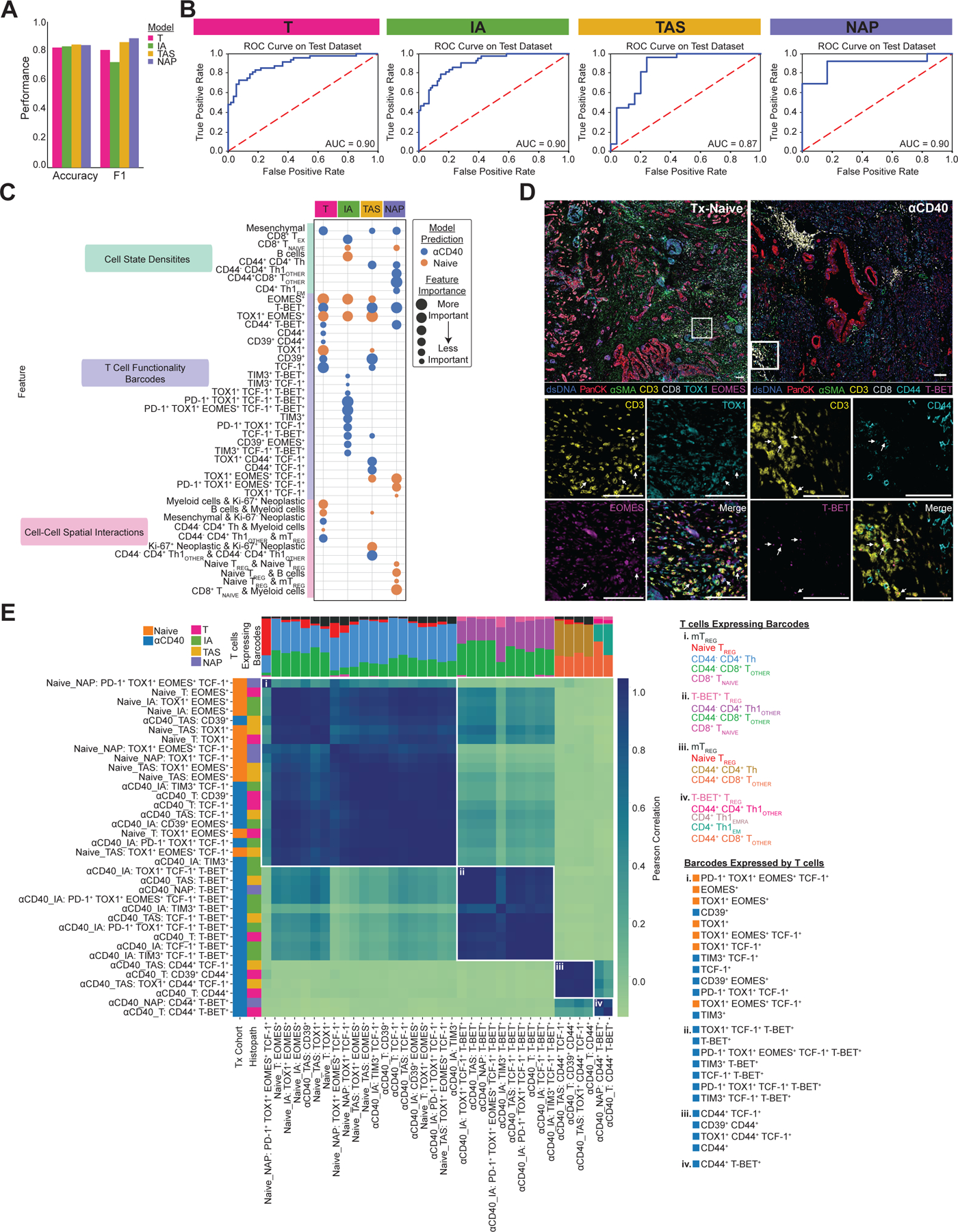
Figure 3. ML models classify anti-CD40-treated TMEs as having reduced T cell exhaustion phenotypes.

A. Bar chart showing accuracy and F1 score for each histopathologic model that predicts treatment status.
B. ROC curve with corresponding AUC for each histopathologic model.
C. Bubble chart showing top 15 features whose increased presence drove each histopathologic model to predict treatment-naive (orange) or anti-CD40-treated (blue). Features are grouped by TME feature type (density, barcode, interaction). Bubble size denotes relative importance of the feature for a given histopathologic model. Bubbles appearing multiple times in the same row indicate TME feature is a top feature across histopathologic models.
D. Representative pseudo-colored mIHC images showing TOX1+ and/or EOMES+ CD3+ T cells in treatment-naive tissue (left) and CD44+ and/or T-BET+ CD3+ T cells in anti-CD40-treated tissue (right).
E. Matrix showing correlations between top barcodes from the models with each other based on types and proportions of T cell states expressing the barcodes. Stacked bars at the top of correlation matrixes show proportions of T cell states expressing barcodes, with T cells color coded and listed for each group to the right of the heatmap, along with corresponding barcodes in each group. Leftmost columns are color coded according to which treatment group the presence of the barcode was predicted by the model, followed by the histopathologic site the model was derived from.
