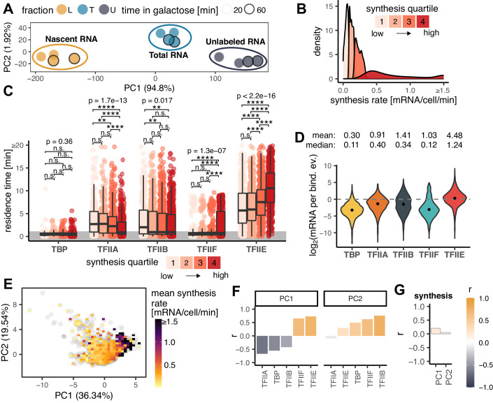
Figure 3. Relationship between residence GTF residence times and synthesis rates.
(A) PCA plot showing a low-dimensional representation of dynamic transcriptome analysis (DTA) samples without negative control. (B) Distribution of mRNA synthesis rate values measured by DTA separated into synthesis quartiles. (C) Box plots showing residence time distributions (y-axis) for all GTFs (x-axis) within the indicated synthesis quartile. Values for reliably fast sites (<1 min) were randomly generated for plotting purposes and are highlighted by the gray area. The middle line represents the median, the lower and upper edges of the boxes represent the first and third quartiles, and the whiskers represent the 1.5 * interquartile range. P values represent the results of Kruskal–Wallis tests for a given GTF. P value symbols (Wilcoxon test): n.s. p ≥ 0.05, *p ≤ 0.05, **p ≤ 0.01, ***p < 0.001, ****p ≤ 0.0001. Number of observations (n): TBP- Q1: 216, Q2: 324, Q3: 427, Q4: 605; TFIIA- Q1: 239, Q2: 320, Q3: 397, Q4: 426; TFIIB Q1: 302, Q2: 486, Q3: 581, Q4: 606; TFIIF- Q1: 253, Q2: 358, Q3: 432, Q4: 517; TFIIE- Q1: 416, Q2: 584, Q3: 610, Q4: 553. (D) Violin plots showing the distributions of log2 transformed transcription efficiency (TE, y-axis) for each GTF (x-axis). TE indicates the number of mRNA molecules synthesized during one binding event. The points show the medians of the log2 transformed TE values. Mean and median TE values are shown above the plots. Number of observations (n): TBP = 1572, TFIIA = 1382, TFIIB = 1975, TFIIF = 1560, TFIIE = 2163. (E) PCA plot showing a low-dimensional representation of gene targets based on GTF residence times. Each gray point is a gene, color map shows the mean synthesis rate of genes under a given area. The percentage within the axis labels indicates the percentage of variance explained by a given PC. (F) Pearson’s correlation coefficients (y-axis) between the indicated PCs (panel title) and GTF (x-axis) residence times. (G) Pearson’s correlation coefficients (y-axis) between PCs (x-axis) and synthesis rates. Source data are available online for this figure.

