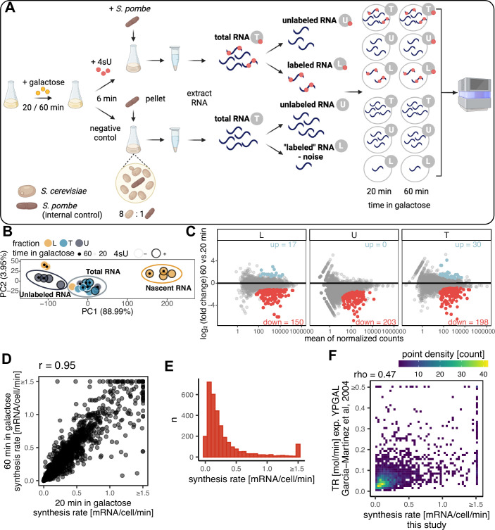
Figure EV2. Synthesis rate estimation with dynamic transcriptome analysis (DTA).
(A) Schematic overview of the DTA method as adapted in this study. (B) Principal component analysis (PCA) plot showing the first two principal components (PCs) calculated from normalized read coverage signal from all samples generated in this study. Highlighted are clusters of samples representing nascent RNA (L fraction after 4-sU addition), total RNA (T fraction after 4-sU addition as well as from negative control, along with U fraction from negative control), and unlabeled RNA (U fraction after 4-sU addition). Percentages within the axis labels indicate the percentage of variance explained by a given PC. (C) MA plot showing differentially expressed genes between samples grown for 60 vs. 20 min in galactose. Each point represents a gene, the x-axis indicates the size of a given gene in terms of the mean number of reads after normalization mapped to the gene, and the y-axis shows log2 of fold change between the two conditions. Highlighted are significantly misregulated genes, blue: upregulated at 60 min, red: downregulated at 60 min compared to the 20-min time point, significance threshold: FDR-corrected p value (padj) <0.05. (D) Comparison of synthesis rates (in mRNA per cell per minute) estimated from samples grown for 20 min in galactose (x-axis) vs. 60 min in galactose (y-axis). Pearson’s correlation coefficient can be found above the plot. (E) Histogram showing the distribution of synthesis rates (in mRNA per cell per minute) estimated jointly from samples grown for 20 and 60 min in galactose. Synthesis rates higher than 1.5 were combined into one bar to eliminate long tails. (F) Comparison of synthesis rates generated in this study (x-axis) to those generated by García-Martínez et al, 2004 (García-Martínez et al, 2004). Spearman’s correlation coefficient is mentioned above in the plot. The plot is color-coded based on point density in each area. Symbol ≥ on the axis indicates that values higher than an indicated value were shrunk for plotting purposes to eliminate outliers.

