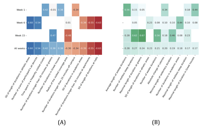
Figure 5.

The heat map displays the correlation between sensor features and productivity by week. The left side shows the 10 sensor features with the highest aggregated correlation over all 3 weeks, and the right side shows the 10 sensor features with the highest aggregated significance score over all 3 weeks. The blank cells shown in the figure mean that the relationship is not significant. (A) Average of correlation (C-SF); (B) Significance score of correlation (S-SF). C: correlation coefficients; S: significance score; SF: sensor feature.
