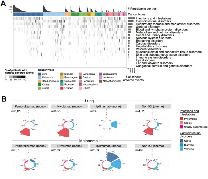
Figure 2.
Frequency of severe adverse events. (A) Frequency of severe adverse events in each clinical trial as summarized by the SOC hierarchy. The bar graph above the heatmap shows the number of participants recruited in a trial. For the purpose of visualization, the maximum number of participants shown is capped at 500, and trials with less than 50 recruited participants are not shown. The intensity of the heatmap represents the frequency of the reported SOC in each trial. The horizontal bar graph to the right shows the total number of severe adverse events by SOC category. (B) The frequency of secondary-level adverse events terms associated with the SOC “infections and infestation” (shades of red) and “gastrointestinal disorders” (shades of blue) in lung (top panel) and melanoma (bottom panel). The number of participants administered single-agent monotherapy (mono) or chemotherapy (chemo) alone is indicated on the top-left section of the plot.

