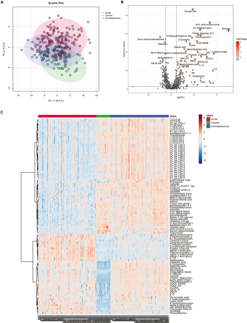
Figure 1.
Statistical analysis of multi-omics datasets
(A) Principal component analysis utilizing proteomics, metabolomics, and cytokines illustrating the different plasma profiles among healthy controls, acute, and convalescence phases of patients infected by SARS-CoV-2. Reprinted and Adapted from Wang et al.1 (B) Volcano plot comparing convalescence samples and healthy controls. Adapted from Wang et al.1 with modifications.
(C) Heatmap showing the top 100 molecules with the most significant p values comparing healthy control with acute and convalescence phases using ANOVA test on log10 transformed data. Reprinted and Adapted from Wang et al.1

