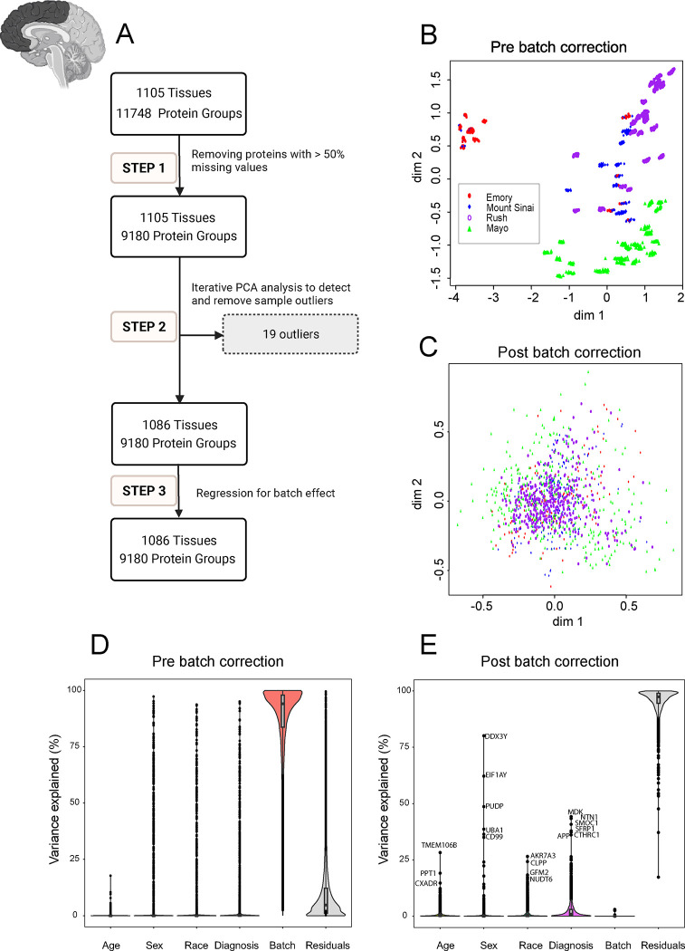
Fig 2. Quality Control (QC) and Batch Correction for DLPFC Tissue proteins.
A. The QC workflow is illustrated in the flowchart in 3 main steps: Step 1. Pre-processing for missing values: Only proteins with missing data in less than 50% of the samples were retained. The ratio of protein abundance to the total protein abundance for each sample was calculated to adjust for sample loading differences resulting in 9180 proteins being retained across 1105 samples. Subsequently, the data was log2 transformation Step 2. Outlier detection and removal: Iterative principal component analysis (PCA) was employed to identify and eliminate sample outliers. After multiple rounds of PCA analysis, 19 outliers were identified and removed, leaving 9180 proteins across 1086 samples. Step 3. Batch effect regression: Variance attributable to batching was mitigated through regression of the 9180 proteins in 1086 samples. B and C. Multidimensional scaling (MDS) plot showing variation among samples (B) before correcting for batch and (C) after regressing for batch effect. The plot dimensions (dim 1 and 2) reveal distinctive clusters formed by samples by site (Emory (red), Mount Sinai (blue), Rush (purple), and Mayo (green)), with some scattering observed among samples before regressing for batch effect (B). (C) The plot illustrates the successful removal of variance due to batch. After correcting for batch effects, samples from all four sites - Emory (red), Mount Sinai (blue), Rush (purple), and Mayo (green) - cluster together, indicating a more cohesive grouping (n.b the change in scale from B to C). The correction mitigates the dispersion observed in panel B, highlighting the effectiveness of the batch correction procedure in harmonizing the sample distribution across different data distribution sites. D and E. Variance partition analysis using experimental factors to evaluate the percentage of explained variance in proteomic samples. Violin plots before (D) and after (E) batch correction illustrate the distribution of explained variances in overall proteomic values. The Y-axis represents the percentage of explained variance, while the X-axis depicts factors contributing to variance, such as age, sex, race, diagnosis, residuals, and batch. Notably, batch variance is present before batch correction, influencing the overall proteomic profile. Panel E displays the same factors on the X-axis after batch correction. Significantly, the violin plot demonstrates a substantial reduction in variance associated with batch, ultimately reaching near zero percent after batch regression. Moreover, even after batch correction, factors such as age, sex, race, AD diagnosis, and other individual traits (residual) had levels of impact on protein abundance patterns. Each point on the violin plot represents a specific protein, with the corresponding name next to it. This underscores the efficacy of the correction procedure in eliminating batch-related variability from the proteomic data.

