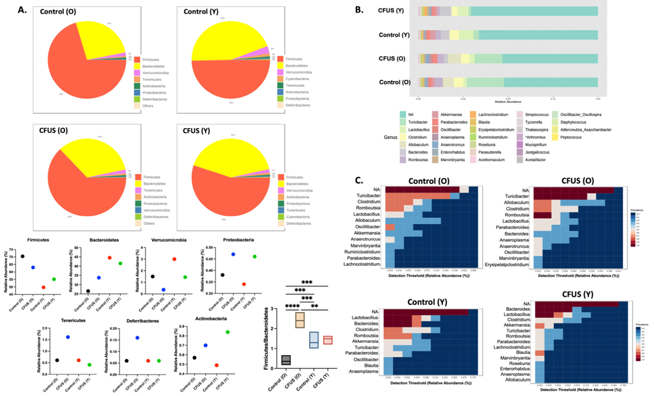
Fig. 2.

Pattern discovery analysis showed changes in microbiome abundance with age and treatments. A. Pie charts representing relative phylum abundance constituting microbial community in each treatment group. Bar graphs represent the abundance percentage of phylum present in all groups. B. Stacked bar plot of the phylogenetic composition of common bacterial taxa at genus level in different treatment groups. C. Heatmap representing the relative abundance of the most prevalent genus (>0.01 Detection threshold) in each treatment group. Statistical analysis was done using one-way ANOVA with Fisher’s LSD test, **p < 0.005, ***p < 0.0005, ****p < 0.0001.
