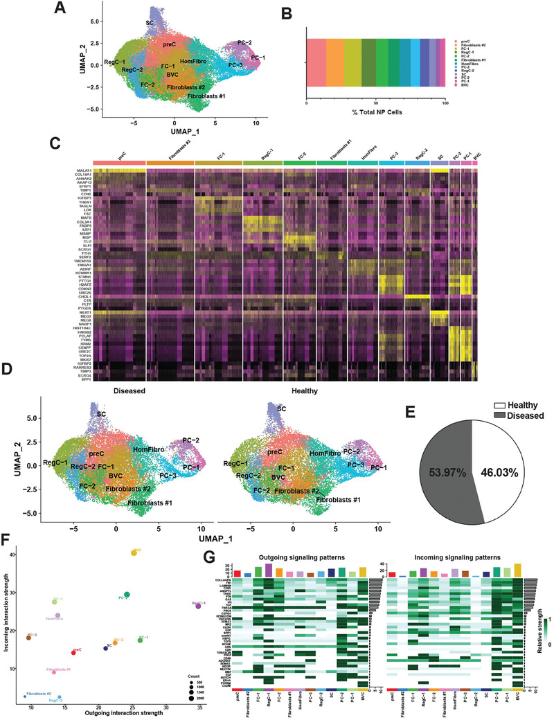
Figure 2.

Single‐cell RNA sequencing of healthy and diseased human NP. A) Visualization of clustering by UMAP plot of healthy and diseased NP samples (n = 11) using 0.5 resolution. B) Quantification of NP cluster contribution shown as percentage of total NP cell count of the integrated data set. C) Top markers for each NP cluster visualized in a heat map. D) Visualization of clustering by split UMAP plot of healthy (n = 3) versus diseased (n = 8) NP samples. E) Percentage of cells from each condition (healthy versus diseased) are shown in a pie chart. F) CellChat analysis was performed to interrogate cell‐cell communication patterns between clusters in NP. Overall outgoing and incoming signal strength of each cluster was visualized in a scatter plot. G) Relative strength of all enriched signals across NP clusters was visualized in a heat map. For all panels: GenC (general chondrocytes), RegC (regulatory chondrocytes), FC (fibrochondrocytes), HomC (homeostatic chondrocytes), HomFibro (homeostatic fibroblasts), PC (progenitor cells), SC (stem cells) and BVC (blood vessel cells). Healthy = grade II; Diseased = grade II‐III, grade III and grade III‐IV.
