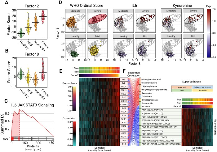
Figure 5.
Downstream COVID-19 dataset analysis. (A) Grouped violin plot of factor 2 scores (y-axis) and simplified WHO score (x-axis), with group means marked with a line. (B) Grouped violin plot of factor 8 scores (y-axis) and simplified WHO score (x-axis), with group means marked with a line. (C) GSEA plot for IL6 JAK STAT3 Signaling Hallmark pathway for SPEAR Factor 2. Proteins are ranked by their assigned projection coefficient from SPEAR factor 2. (D) Embedding of samples by factor 8 (x-axis) and factor 2 (y-axis) scores. Samples are colored by WHO Ordinal Score, normalized IL6 expression, and normalized kynurenine expression. (E) Heatmap showing normalized expressions for proteins involved in the IL6 JAK STAT3 Signaling Hallmark pathway. Samples were ranked by Factor 2 score (x-axis) and proteins were ranked by projection coefficient (y-axis). Also shown are corresponding true patient severity scores (True) and SPEAR (sd) predicted severity scores (Pred). (F) Alluvial plot showing correlation between the IL6 JAK STAT3 proteins and the top metabolite features contributing to SPEAR Factor 2. Metabolites are grouped by positive/negative correlation and super-pathway. Also shown are normalized plasmalogen expressions of samples ranked by Factor 2 score (x-axis)

