Fig. 4.
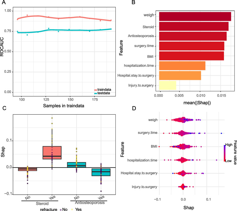
Interpretability of models. A Learning curve analysis. This figure depicts the learning curve of the machine learning model, with the Y-axis being ROC_AUC and the X-axis being the number of samples in the training data. The red line represents the performance of the model on the training data and the blue line represents the performance on the test data, indicating how well the model generalises to the unknown data as the number of training samples increases. B Feature Importance Bar Graph. The bar chart shows the average SHAP value for each feature, indicating their average impact on the model output. The longer the bar, the greater the impact of the feature on the model prediction. C Box plot of SHAP values by fracture feature.The distribution of SHAP values shows the variability of the impact of each feature on the model prediction of a case. D Swarm plot of SHAP values. This plot visualises the individual SHAP values for each feature as dots in order to observe the distribution and density of the impact of each feature on the model output. The points are coloured according to the feature value, with pink indicating high values and blue indicating low values, indicating the increasing or decreasing effect of each feature value on the predicted risk of fracture

