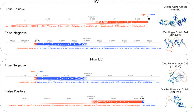
FIGURE 5.

Shapley value analysis of case examples. SHAP plots for local interpretability are shown for correctly predicted proteins (i.e., true positive, true negative), as well as proteins for which the model prediction and the annotation from our data curation workflow do not agree with each other (i.e., false positive, false negative) from our test set. We chose examples in which the predictor is very certain if the individual protein is EV associated or not. Each SHAP plot displays a set of SHAP values that explain for each individual protein which features contributed to the model's prediction. Features in red contribute to the prediction being higher (i.e., EV associated), and features in blue decrease the predicted score (i.e., non‐EV). Protein structures shown here are predicted by AlphaFold (Jumper et al., 2021).
