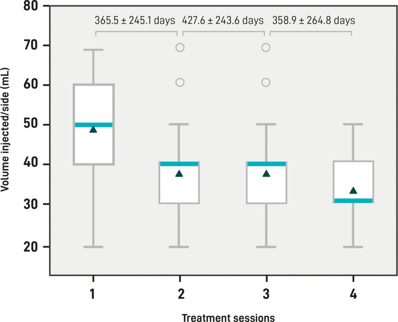
Fig. 5.
HA filler volume injected. Box plots represent the lowest quartile, median, upper quartile, and highest observations of the mean volume (mL) injected in each session per side. Circles indicate the outliers. Mean and SD days of intervals between each session and the successive session are shown at the top of the plot.

