
FIGURE 2.
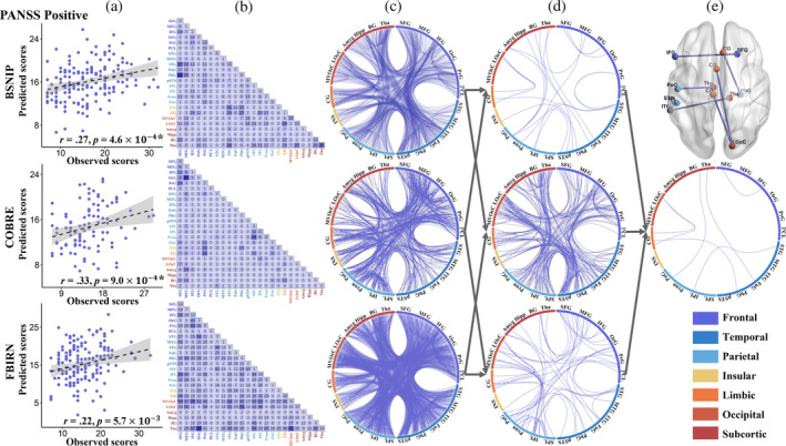
The prediction results for the positive symptoms in three cohorts. (a) Scatter plots showing model‐predicted and actual scores for positive symptoms in each cohort. (b and c) Distribution of the top 80% features contributing to predicting the positive symptoms. (d) Overlay of the FCs from any two cohorts. (e) Overlay of the FC features consistently identified across the three cohorts.