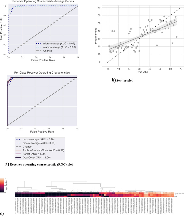
Fig. 5.
Receiver Operating Characteristic (ROC) curves - a The ROC curve plots the relationship between the true positive rate (TPR, on the y-axis) and the false positive rate (FPR, on the x-axis) at various threshold settings. The line on the top-left corner of the plot indicates GA soil diversity, the pink line indicates forest diversity, and the light orange line indicates AP soil diversity. Thus, the top-left corner of the plot represents the “optimal” performance position, indicating a FPR of zero and a TPR of one. This “optimal” scenario is unlikely to occur in practice, but a greater area under the curve (AUC) indicates better performance. This can be compared to the error rate achieved by random chance, which is represented here as a diagonal line extending from the lower-left to upper-right corners. Additionally, the “steepness” of the curve is important, as a good classifier should maximize the TPR while minimizing the FPR. In addition to showing the ROC curves for each class, average ROCs and AUCs are calculated. “Micro-averaging” calculates metrics globally by averaging across each sample; hence class imbalance impacts this metric. “Macro-averaging” is another average metric, which gives equal weight to the classification of each sample. b Scatter plot: Linear regression scatter plots (for regression) of predicted and expected classes/values for soil microbiome. c Supervised machine learning generated a heatmap of the top 100 taxa. All taxa that contributed to the majority of the sequences among the sample belonged to Candadatus Phyla Radiation

