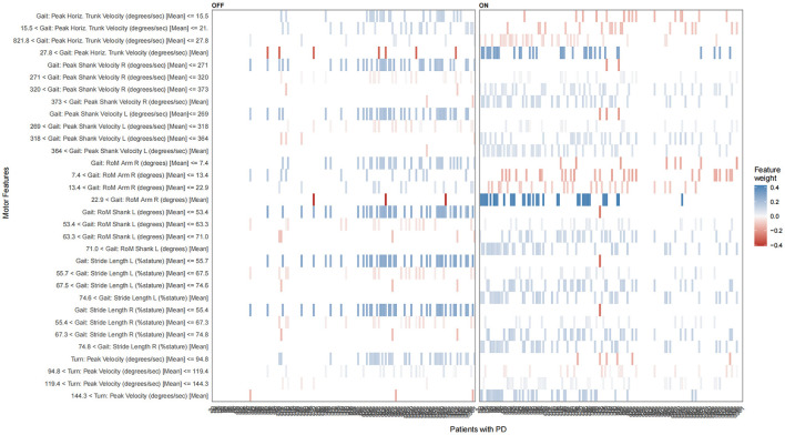
Figure 4.
The LIME plot of the NB model in the training datasets. The blue bar represents a positive effect, and the darker and denser the blue bar, the more likely it is to have a positive effect. The red bars represent negative effects, and the darker and denser the red, the more likely they are to have negative effects.

