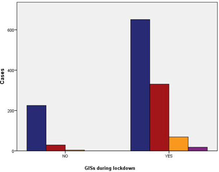
Figure 3.
Clustered bar chart based on the contingency table related to the interactions between GISs and anxiety state during the lockdown period.The blue bar graph represents No anxiety, the red bar graph indicates light anxiety, the yellow bar graph indicates medium anxiety, the purple bar graph indicates heavy anxiety, the horizontal axis NO represents No GISs during lockdown, the horizontal axis Yes represents yes GISs during lockdown. Crosstabs Person Chi-Square, p-value:0.000(<0.001).

