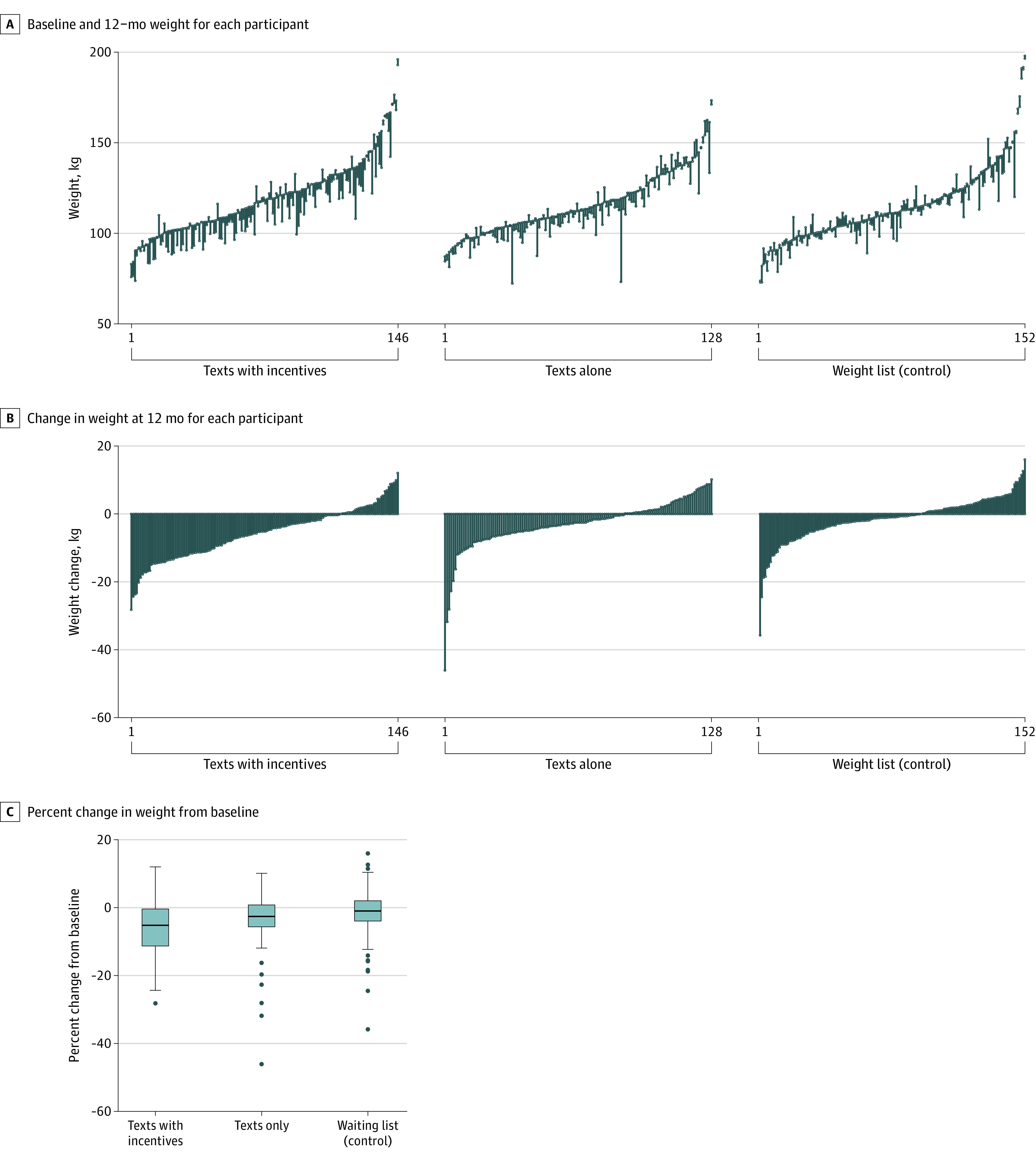
Figure 2. Weight Change and Percent Weight Change From Baseline to 12 Months .

The thick lines in the boxes represent the median; the bottom and top of the box, the first and third quartiles, respectively; whiskers, an additional 1.5 times the IQR lower than the first quartile and higher than the third quartile; and dots, more extreme values that lie outside 1.5 times the IQR.
