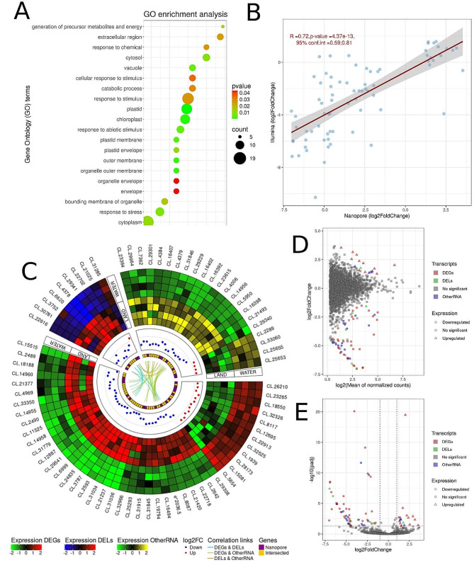
Fig. 1.
Gene expression profiling of land and water form of Riccia fluitans based on direct RNA. A. Dotplot chart of enrichment ontology of genes. The circles represent pathways described along the y-axis, colors reflect the adjusted p-value of enrichment statistics, and the sizes of the circles represent the number of genes enriched in each pathway. B. The dotplot illustrates the correlations between statistically significant genes from nanopore sequencing and genes from Illumina sequencing. The x-axis represents log2FoldChange values for nanopore sequencing, while the y-axis depicts log2FoldChange values for Illumina sequencing. The red line highlights the Pearson correlations. The R value, p-value and confidence interval (conf.int) are displayed in the upper left corner. The gray bands around the line represent the standard error of the regression line. C. Circular plot depicting the relationships between significant genes. The first track shows 3 heatmaps, which show the expression level in each of the significant genes. The green-black-red scale represents the expression of DEGs, the blue-black-red scale represents the expression of DELs, and the green-black-yellow scale represents the expression of other RNAs. The second track describes the log2FoldChange values of upregulated (red) and downregulated (blue) genes. The third track shows the unique genes that were found in the nanopore data analysis (purple color) as well as the common genes (gold color) in the differential analysis in Illumina and Nanopore. The internal track depicts the correlation relationships, where the blue link represents the correlations between DEGs and DELs, green for DEGs and other RNAs, and orange for DELs and other RNA. D. The MA plot visualizes the association between log2FoldChange and log2 from the average of normalized counts. The x-axis displays the log2 of the average of the normalized gene counts, while the y-axis illustrates the log2FoldChange for the gene. Squares represent irrelevant transcripts, triangles represent upregulated transcripts, circles represent downregulated transcripts, and the green color indicates DELs, red indicates DEGs, blue indicates other RNAs, and grey indicates no significant genes. E. Volcano plot depicting log2 Fold Change (log2FC) for significant genes. The x-axis displays the log2FC values for each gene, while the y-axis shows the negative log-adjusted p-value (p-adjusted). The horizontal dashed line represents the negative logarithmic p-adjusted cutoff value (0.05), and the two vertical lines equal the absolute value of 1 log2FC. Coloured points indicate statistically significant genes, while grey points represent non-significant genes

