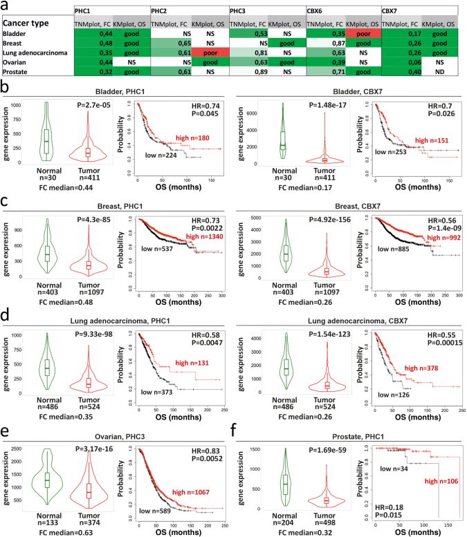
Extended Data Fig. 9. Examples of the tumour suppressive role of canonical PRC1 core subunits in different cancer types.
a- Clinical correlations for PRC1 in selected cancer types. Differential gene expression (TNMplot) and clinical prognosis Kaplan-Meier plot (KMplot) results are given for PHC1, PHC2, PHC3, CBX6, CBX7 genes. TNMplot columns represent the differential gene expression analysis in tumour and matched normal tissues, which was performed using the https://tnmplot.com/ online tool. FC median: Fold change median. Statistical significance was calculated using a two-sided Mann-Whitney U test with a significance level of 0.01. NS – non-significant Mann–Whitney p-value. Green boxes indicate that gene expression is significantly lower in tumour tissues. KMplot columns show the analysis of correlation between overall survival (OS) and levels of gene expression. KMplot analysis was performed using the https://kmplot.com/ online tool. Statistical significance was calculated by a two-sided Cox regression test with a significance level of 0.05. NS – non-significant logrank p-values. Green boxes (“Good”) indicate cases in which high expression of PRC1 genes in tumours is associated with a better overall patient survival. b- Clinical prognosis for PHC1 (left) and CBX7 (right) in bladder cancer. For each gene the TNMplot (Violin plots, left panels) and KM plots (right panels) are shown. c- Clinical prognosis of PHC1 (left) and CBX7 (right) in breast cancer. For each gene the TNMplot (Violin plots, left panels) and KM plots (right panels) are shown. d- Clinical prognosis of PHC1 (left) and CBX7 (right) in lung adenocarcinoma. For each gene the TNMplot (Violin plots, left panels) and KM plots (right panels) are shown. e–f Clinical prognosis of PHC3 (e) in ovarian and PHC1 (f) in prostate cancer. For each gene the TNMplot (Violin plots, left panels) and KM plots (right panels) are shown. The Violin plots display the range of values from the minimum to the maximum value, with the box representing the values from the first quartile to the third quartile. The median is indicated by the thick line in the center, and the width of the plot, or density, reflects the frequency of the samples. In KMplots, the cohort with low gene expression level is coloured black and the cohort with high gene expression is coloured red. HR: hazard ratio.

