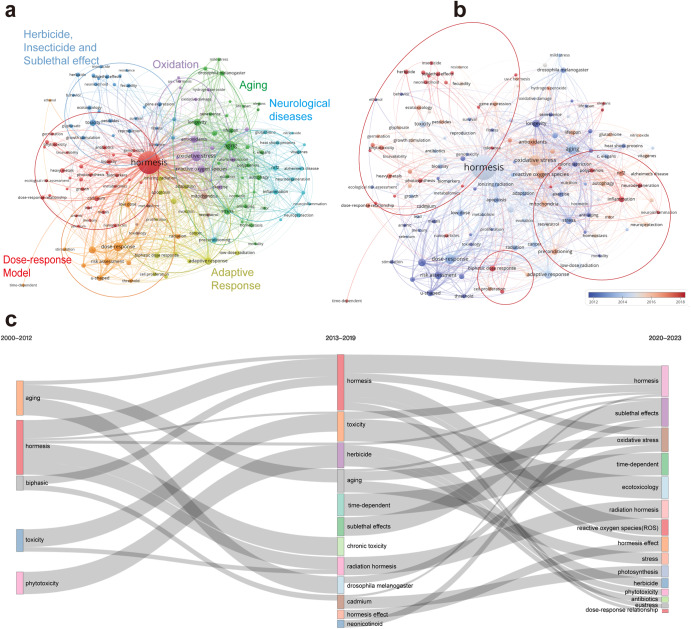
Fig. 6. The analysis of keywords related to hormesis.
a The co-occurrence keywords’ map of hormesis research visualizes the relationships between keywords involved in the study. The nodes, represented by different colors, correspond to keywords of different clusters. The size of each node indicates the frequency of co-occurrence, while the connections between nodes represent the co-occurrence relationships among keywords. b The figure displays the ratio of keywords to the total number of keywords in the past five years, reflecting the relative contribution of each institution to hormesis research compared to their overall contribution from 2000 to 2023. The color scale in the figure represents this ratio, with a red bias indicating a higher ratio. This indicates that institutions with a red bias are emerging as influential contributors in the field of hormesis. Conversely, a blue bias suggests a lower ratio, indicating that these institutions have conducted less research on hormesis in recent years. c The chronological Sankey diagram depicts the developmental trends and interconnections of keyword popularity over time. The width of the bands and connecting lines is proportional to their respective popularity and correlation strength. It is important to note that the years covered by the three time periods are not uniform but decrease in sequence according to their temporal distance. This is done to present more accurate and valuable recent trends.

