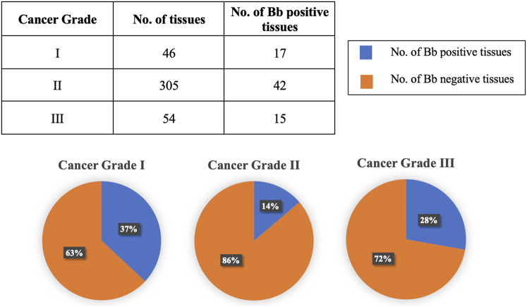
Fig. 7.
Represents a quantitative analysis of B. burgdorferi-positive samples categorized by their respective cancer grade. The pie charts illustrate the percentage of B. burgdorferi-positive tissues (depicted in blue) relative to the total number of tissues identified within each grade. Additionally, the table above provides the numerical tissue count for each grade alongside the number of B. burgdorferi-positive samples in each grade

