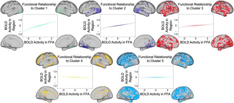
Figure 3. .
K-means clustered voxels. Each plot represents the relationship between (z-scored) activity in the FFA (seed region) and the (z-scored) activity in the highlighted region. Because the coordinate loadings are defined with respect to the normal probability density function (see formula 11), the intensity of the line color is weighted by the normal probability density function in order to illustrate how the confidence in the prediction of estimated activity varies as activity in the seed region varies. The strongest positive relationship is observed in ventral and lateral posterior temporal regions (green cluster). Note a negative relationship with a cluster of regions in the vicinity of the default mode network (yellow cluster).

