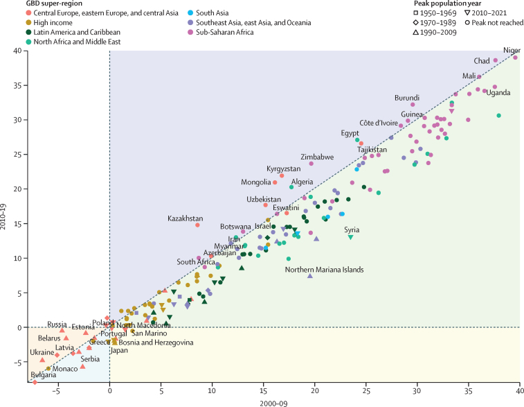
Figure 10.
Rate of natural increase in population, 2010–19 versus 2000–09
Rate of natural increase is shown for 204 countries and territories coloured by GBD super-region. The rate of natural increase is calculated as the number of births minus the number of deaths divided by the person-years during the time period. The shape of the datapoints represents the year that peak population was reached. Purple shading indicates a higher rate of natural increase between 2010 and 2019 than between 2000 and 2009; green shading denotes a higher rate between 2000 and 2009 than between 2010 and 2019; yellow shading indicates a negative rate between 2010 and 2019 and a positive rate between 2000 and 2009; blue shading denotes a negative rate across all years that was most pronounced between 2010 and 2019; orange shading indicates a negative rate across all years that was most pronounced between 2000 and 2009; white shading denotes a negative rate between 2000 and 2009 and a positive rate between 2010 and 2019. The years 2020 and 2021 were omitted due to the impact of the COVID-19 pandemic on deaths. GBD=Global Burden of Diseases, Injuries, and Risk Factors Study.

