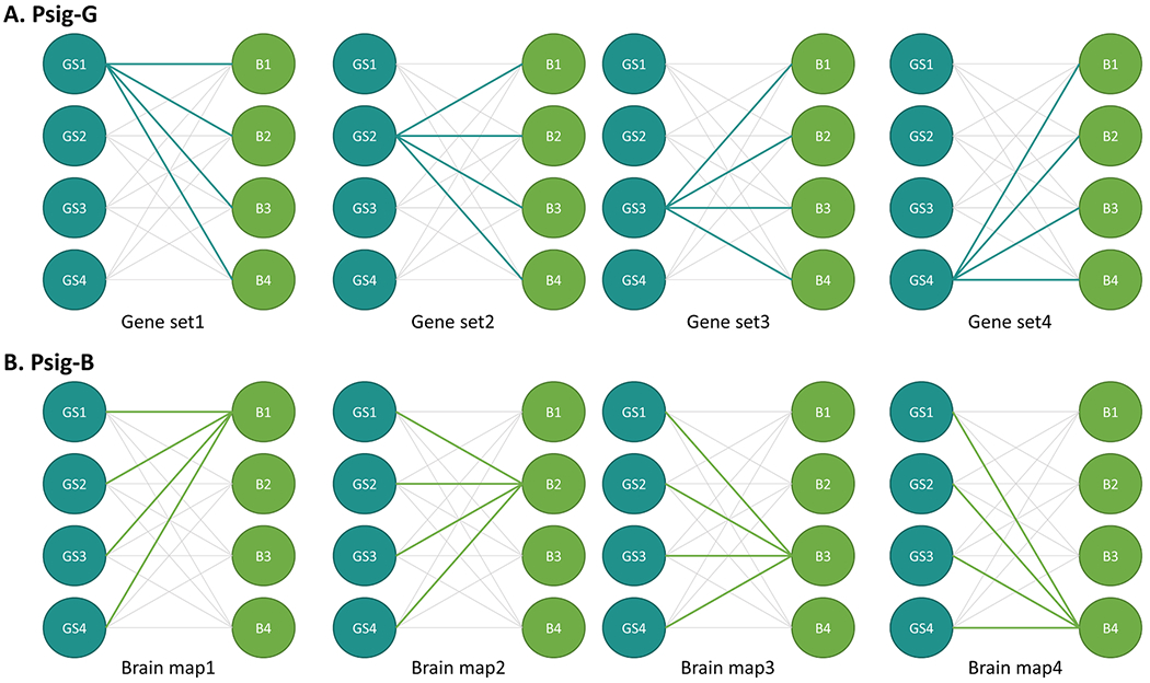
Fig. 2.

Illustration of calculation of Psig-G (A) and Psig-B (B). Blue circles represent simulated gene sets, green circles represent simulated brain maps, and the lines between them denote one of the statistical tests examined. The panels show examples of the calculation of Psig-G for four gene sets (A) and Psig-B for four brain maps (B). Psig-G represents the proportion of simulated brain maps that significantly correlate with a gene set, while Psig-B represents the proportion of gene sets that significantly correlate with a brain map.
