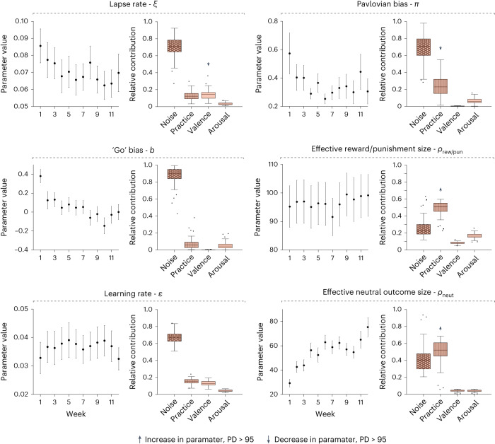
Fig. 4. The dynamic computational phenotype in the Go/No-go task.
For each parameter, the left plot shows its mean ± s.e.m. across participants in each week (derived from the independent model; error bars show the s.e.m. across participants), and the right plot shows the relative contribution of each source (derived from the dynamic model). Arrows indicate the direction of the effect on each parameter over time for effects with PD > 95: up, positive; down, negative. The centre line marks the median, the box limits indicate the IQR and whiskers extend to the most extreme data points not considered outliers (points that are farther than 1.5 IQR from the box limits).

