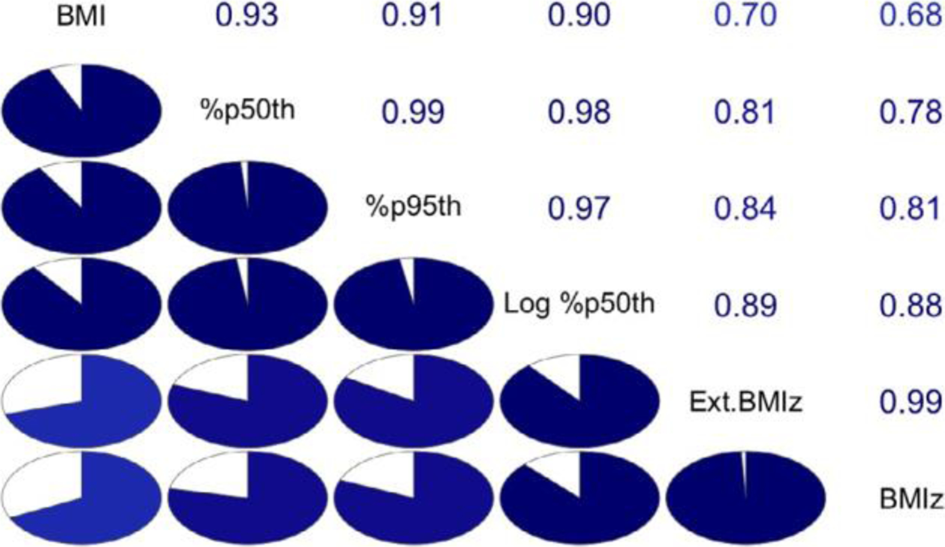
FIGURE 3.

Correlogram representing the correlation among changes (3rd visit – 1st visit) for the 6 BMI metrics. The metrics’ names are along the main diagonal. Metrics are arranged according to their first 2 principal components so that the strongest correlations are near the diagonal. The lower left panel represents the correlations as pie charts: the stronger the correlation, the fuller is the circle
