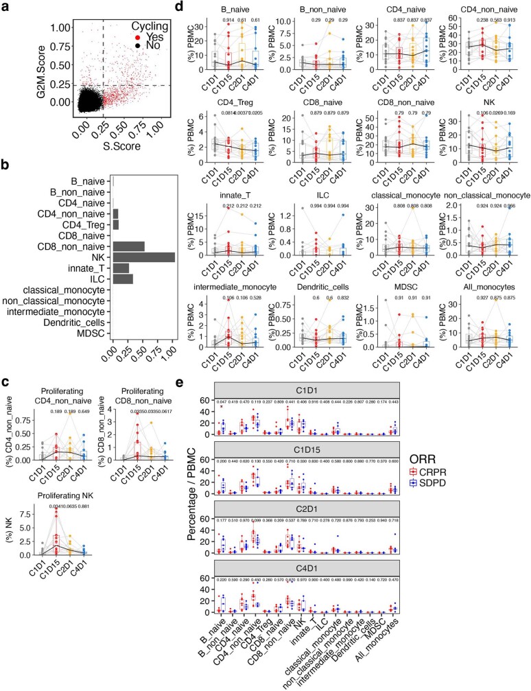
Extended Data Fig. 3. The proportion of proliferation cells and major cell types in PBMC.
a, Scatter plot showing the S and G2M cell cycle phase scores, coloured by cells in proliferating (red) or non-proliferating states (black). b, Bar plot showing the proportion of proliferating cells in each major cell type. c, Box plots showing the proportion of proliferating cells in CD4_non_naive, CD8_non_naive, and NK cells, across each timepoint. d, Box plots comparing the proportions of each cell type at on-treatment (C1D15, C2D1, and C4D1) versus baseline (C1D1). e, Box plots comparing the proportions of each cell type between responders and non-responders at baseline (C1D1) and on-treatment (C1D15, C2D1, and C4D1). c-e, Boxplot center line, median; box, interquartile range (IQR; the range between the 25th and 75th percentile); whiskers, 1.58 × IQR. c,d, Median values per time point are connected by solid black lines; samples from the same patient at different time points are connected by grey lines. c-d, P values shown were calculated by two-tailed paired Student’s t-test and BH-adjusted. e, Nominal P values derived from two-tailed unpaired Student t-test are shown and red asterisk represents significance levels where * P < 0.05. c-e, n = 16 patients.

