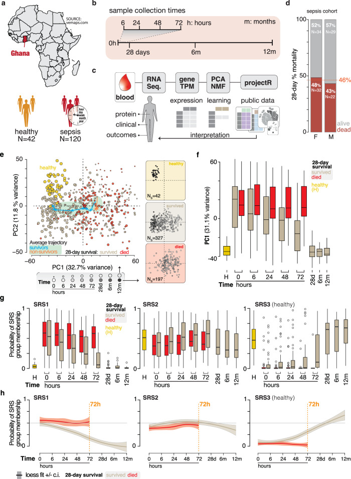
Fig. 1. Host gene expression describes recovery in sepsis subjects that survive.
a Description of the study cohort geographic location and size (N = subjects). b The longitudinal collection time points from subjects starting at enrolment (0 h). c Analytical pipeline used in this study. d Breakdown of the sepsis cohort subjects by 28-day mortality and sex. The red line and number show the combined percent 28-day mortality for both sexes. e Principal component analysis of gene expression in sepsis subjects and healthy donors. Left plot: the size of the points corresponds to collection time (d: days, m: months). Healthy (gold), surviving (tan), and subjects that died by 28 days (red). Lines with arrows and green shading show the average PCA signal for 28-day survivors (blue), and those who died by 28 days (orange). Right plots: the same three groups of subjects where fill intensity corresponds to collection time points. f The PC1 values of healthy (gold), 28-day surviving (tan), and subjects who died by 28 days (red) at each collection time point. g Subjects were analyzed with SepstratifieR machine learning algorithm to determine their membership in one of three sepsis response groups (SRS) (Cano-Gamez et al., 2022). h Regression analysis (locally weighted least squares [loess] fit line ± confidence intervals [c.i.] as shaded area) with the same groups as in (g) depicting the change in SRS group membership over time for 28-day survivors (gray) and those who died by 28 days (red). Exact sample numbers (n) for figure panels are described in Supplementary Data 2. The boxplots in (f, g) describe the median (middle horizontal line), 1st and 3rd quartiles (bottom and top of box, respectively), and data minimum and maximum (vertical whiskers).

