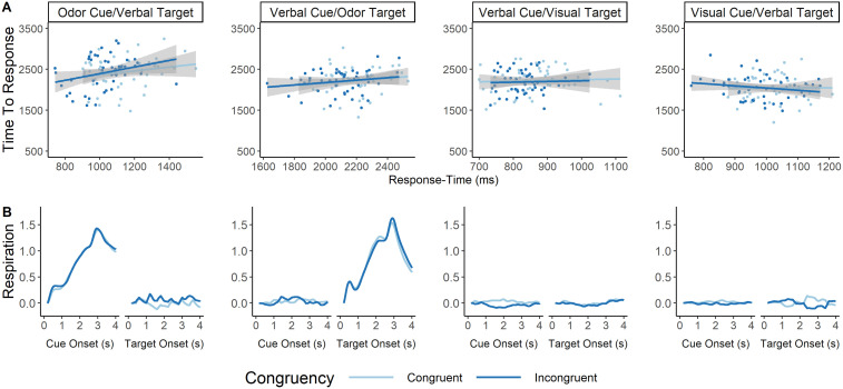
Figure 4.
A, Correlation between response time and time-to-peak sniff per condition and congruency type. Each graph represents how similar response times co-occur with how long it takes to reach maximal sniff amplitude. We looked at these correlations separately for each of the four block types, although we were most interested in blocks where the target or cue was an odor. There were no significant correlations between response time and time-to-peak sniff for any of these eight conditions. The x-axis represents response time in milliseconds. The y-axis represents time-to-peak sniff in milliseconds. Each dot represents an individual participants' average response for each variable, and the responses are split based on whether the averaged trials represent congruent (dark blue) or incongruent (light blue) cue–target combination. B, Average respiration rate at each target and cue type for each block, split between congruency. This figure represents the respiration rate from the time either the cue is onset (first graph of each two graph group) or the target is onset (second graph of each two graph group) taken over the course of the subsequent 4 s. The title above each two graph grouping indicates the modality of the cue and target. As expected, participants inhaled only when either the cue or target were olfactory. No inhalation curve can be seen for visual or verbal cues/targets. The x-axes represent time in seconds since the onset of a cue or target. Each line represents the average respiration signal for congruent (light blue) and incongruent (dark blue) trials. Data have all been normalized such that the very first respiration rate value is zero, and each subsequent respiration rate value is the difference between timepoints. Respiration data were smoothed for visualization via a moving average of 200 ms. Thus, the respiration data only starts at 200 ms on the graph.

