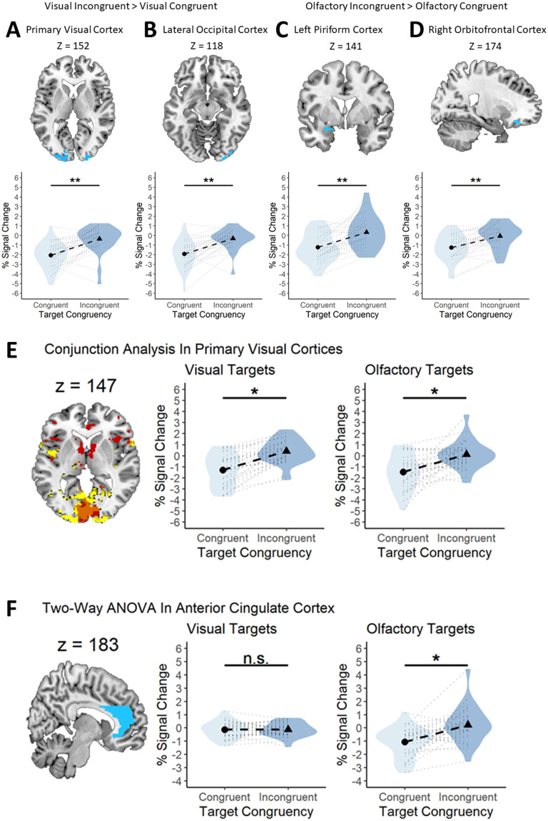
Figure 6.
Visual and olfactory brain regions are sensitive to sensory-specific prediction errors. A–D, Top, Voxels that showed statistically significant activation to incongruent visual targets in the VC (A) and LOC (B) and statistically significant activation to incongruent olfactory targets in the left PC (C) and right OFC (D). A–D, Bottom, Similar activation profiles for incongruent visual targets in each of the four regions. All graphs show the same pattern of results; greater activation in the presence of incongruent target stimuli. The violin represents the density of all the data along the y-axis. Thicker points of the violin represent areas where the data are more clustered and thinner points represent areas where the data are less clustered. E, Primary VC is responsive to both visual and olfactory prediction errors. Left, Panel showing voxels in the VC that are statistically significant for the incongruent > congruent contrast for vision (yellow) and olfaction (red) and their overlap (orange). Middle, A statistically significant difference in fMRI signal change between congruent and incongruent visual stimuli. Right, A statistically significant difference in fMRI signal change between congruent and incongruent olfactory stimuli. F, ACC processes olfactory, but not visual, prediction errors. Left, Panel displaying the mask used to isolate the ACC (blue). Middle, A similar fMRI signal change for congruent and incongruent visual targets. Right, A statistically significant difference in fMRI signal change between congruent and incongruent olfactory stimuli. A-F, Each black circle and triangle in the middle of a violin represents the mean percent signal change for the condition displayed on the x-axis, and each black dotted line shows the magnitude of the difference between the two conditions displayed in a particular plot. The light gray dotted lines surrounding the black dotted line represents a single subjects' percent signal change difference between the two conditions outlined in a particular plot. The violin represents the density of all the data along the y-axis. Thicker points of the violin represent areas where the data are more clustered and thinner points represent areas where the data are less clustered. *p < 0.05. **p < 0.001.

