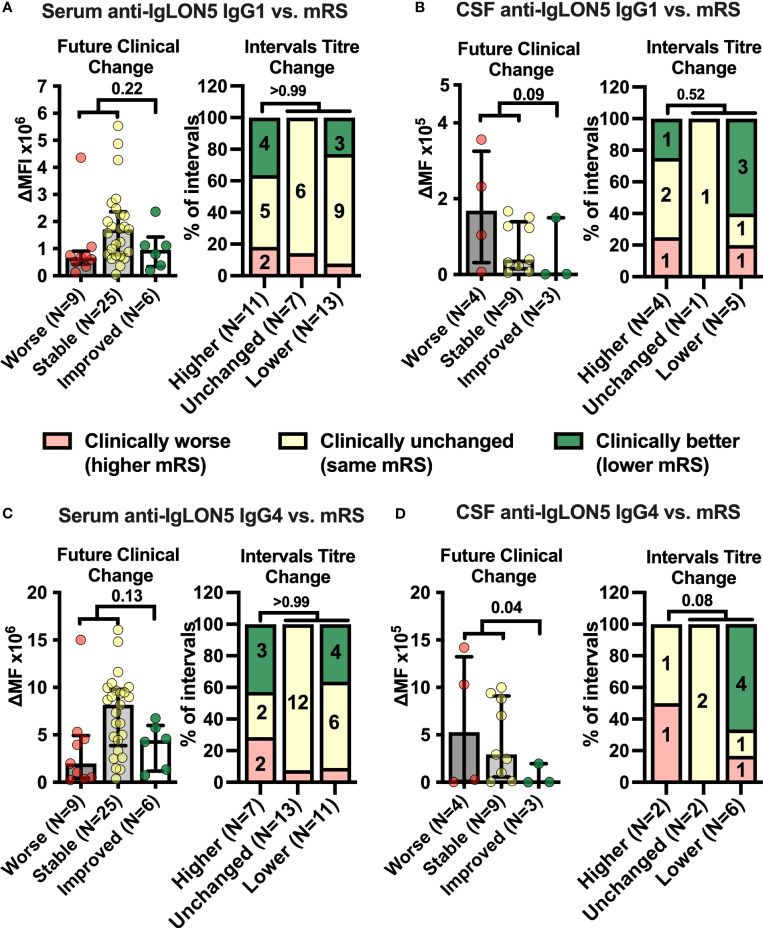
Figure 2.
Cerebrospinal fluid anti-IgLON5 IgG1 and IgG4 levels and their changes over time correspond better with disease severity than serum levels. (A–D) Left graphs: IgLON5 IgG1 (A, B left) or IgG4 (C, D left) levels (bars + error bars = mean ± SEM) in serum (A, C left) and cerebrospinal fluid (CSF, B, D left) measured by flow cytometry and expressed as mean fluorescence intensity above background (ΔMFI) as in Figure 1 were grouped according to future clinical change at the next follow-up visit categorized as clinically worsened (≥ +1 mRS point, red), unchanged (mRS unchanged, yellow) or improved (≤ −1 mRS point, green). If the mRS was 1 (no functional impairment), changes of reported symptoms were used to categorize intervals. (A–D) Right graphs: The clinical change between two consecutive serum (A, C, right) or CSF (B, D, right) sampling intervals was categorized as clinically worse (≥ +1 mRS point, or worsening of symptoms if mRS = 1, red), unchanged (mRS unchanged, or unchanged symptoms if mRS =1, yellow) or improved (≤ −1 mRS point, or improvement of symptoms if mRS =1, green) and changes of anti-IgLON5 IgG1 (A, B right) or IgG4 (C, D right) levels during these intervals were categorized as higher (+ ≥ 20%), unchanged (± 20%), or lower (−≥ 20%). Bars show the percentage of intervals with one of the three clinical change categories when grouped according to the antibody change category. Numbers in stacked bar graphs indicate the number of intervals. Numbers in column titles indicate the numbers of measurements (left graphs) or intervals (right graphs). For statistical analysis, data were dichotomized into clinically worse/stable versus improved (left graphs) or higher levels versus unchanged or lower levels (right graphs) before testing using one-tailed Mann–Whitney U (left graphs) or Fisher’s exact tests (right graphs). The p-values are indicated.

