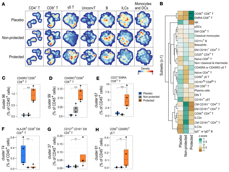
Figure 2. Vaccine-induced immunity associated with protection prior to CHMI.
(A) Hierarchical stochastic neighbor embedding density maps showing differences in major cell lineages among volunteers n the placebo (n = 4), nonprotected (n = 4), and protected (n = 4) groups. The cell density per individual map is indicated by color. (B) Heatmap summary of Z scores of the normalized cell count per cell subset per group, where colors represent the mean Z score as indicated. (C) Box plots showing the frequency of CD56+CD8+ T cell cluster 96, (D) CD56+CD8+ T cell cluster 99, (E) EMRA CD8+ T cell cluster 67, (F) HLA-DR+CD38+ EM CD8+ T cells, (G) CD4+ T cell cluster 37, and (H) CD56+γδ T cell cluster 81 relative to CD45+ cells, comparing placebo (n = 4, blue), nonprotected (n = 4, gray), and protected (n = 4, orange) groups. The box plots represent the median and first and third quantile, and the whiskers represent the maximum/minimum, no further than 1.5 times the interquartile range (IQR). *P ≤ 0.05, **P < 0.01, ***P < 0.001, computed using the GLME model after FDR correction.

