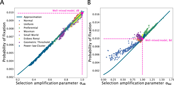
Fig. 3. Probabilities of fixation across graph families.
The fixation probability is shown on the y-axis as we vary the evolutionary quantity α on the x-axis. The dots represent ensemble averages across 106 replicate Monte Carlo simulations, while the lines represent our analytical approximations. Here, graph size N = 1000 and Ns = 10. Each dot represents simulations on a distinct graph. The various colors represent graphs generated using different generation algorithms. A shows results for the death-Birth process. B shows results for the Birth-death process.

